Segmented Control
Description
The Segmented Control is a horizontal set of two or more segments that allow users to select between different, mutually exclusive views or categories. Each segment represents an option, and one option is active at a time. This component is commonly used for filtering content or toggling between views.
Variants & states
Variants
-
Default (Resting): All segments inactive, awaiting user interaction.
-
Active segment: One segment highlighted to show current selection.
-
With icons (left/right): Supports optional icons for each segment.
States
-
Resting: Default non-active state.
-
Active: Selected segment highlighted.
-
Disabled: Segment unavailable for selection.
Anatomy
-
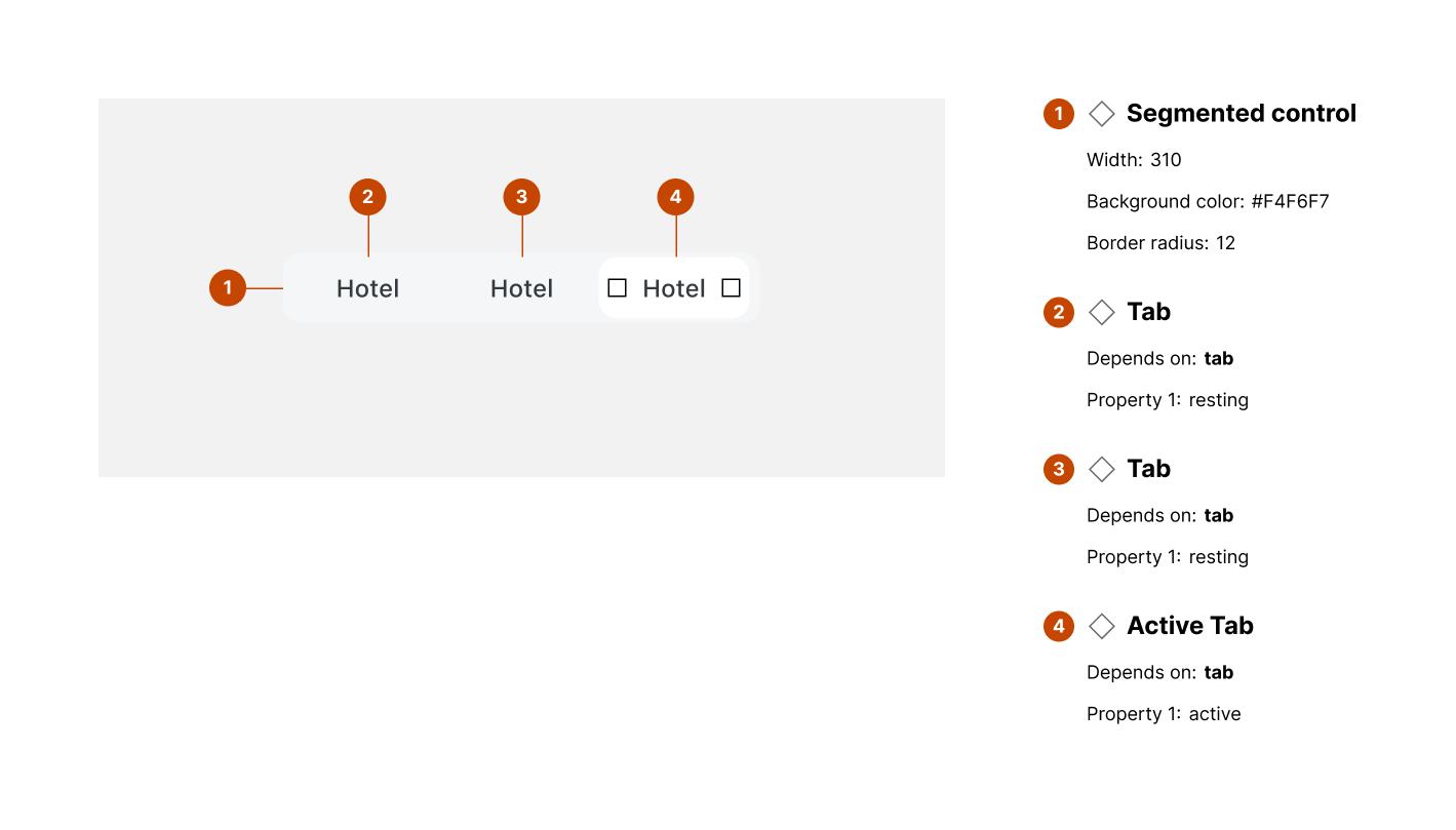
Segmented control container:
-
Width: 310px
-
Background color: #F4F6F7
-
Border radius: 12px
-
-
Tab (inactive):
-
Property: resting
-
Standard text label or optional icon
-
-
Active tab:
-
Property: active
-
Visual highlight (filled background or bold text)
-
-
Optional icons:
- Left/right icons can accompany text labels
Layout and spacing
-
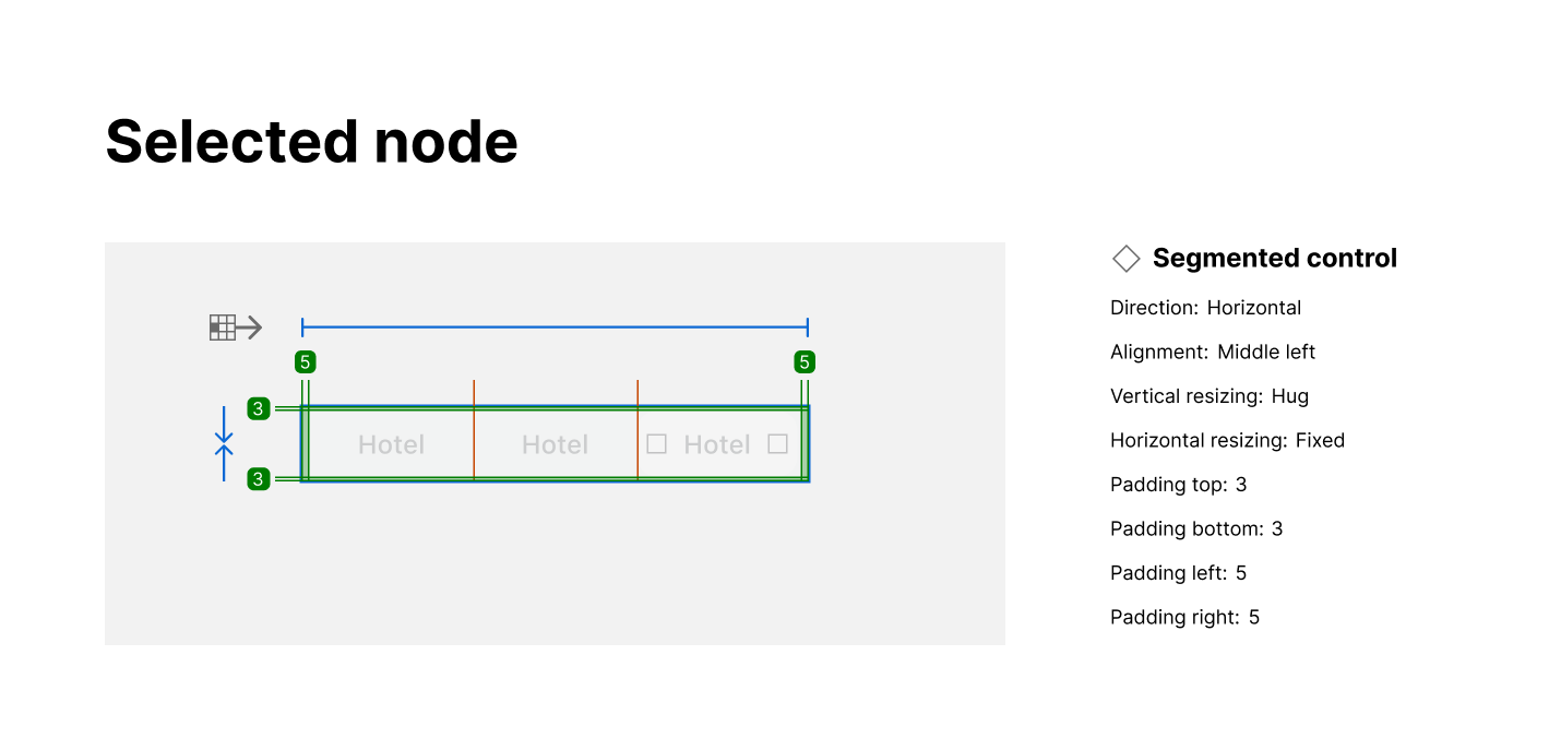
Direction: Horizontal layout
-
Alignment: Middle-left (centered vertically)
-
Vertical resizing: Hug
-
Horizontal resizing: Fixed
-
Padding:
-
Top: 3px
-
Bottom: 3px
-
Left: 5px
-
Right: 5px
-
Usage guidelines
Do ✅
-
Use for switching between mutually exclusive views or filters.
-
Keep segment labels short (1–2 words).
-
Clearly indicate the active segment with distinct styling.
Don’t ❌
-
Don’t use segmented control for unrelated actions.
-
Avoid using more than 3–5 segments to prevent clutter.
-
Don’t rely solely on color to indicate active state (use shape or weight).